Changelog Summary - Version 7.2.0
Version 7.2.0 brings a brand-new Reporting workspace, a clearer schedule, a complete customer overview, and a set of everyday improvements across the app. Here is what is new — and what it means for you.
📊 Reporting — see the whole business at a glance
Reporting is a new section in the main navigation for project managers. It brings five connected views together, so you can move from a company-wide summary to the detail behind it in one click.
- Time analytics: Follow recorded time and costs for any period, filter by project, person, label, task state or billable status, and group the numbers by day, week, month, quarter or year. Switch the currency to compare totals and use the breakdown to see cost by task label and by worker — with a direct link to the underlying time entries.
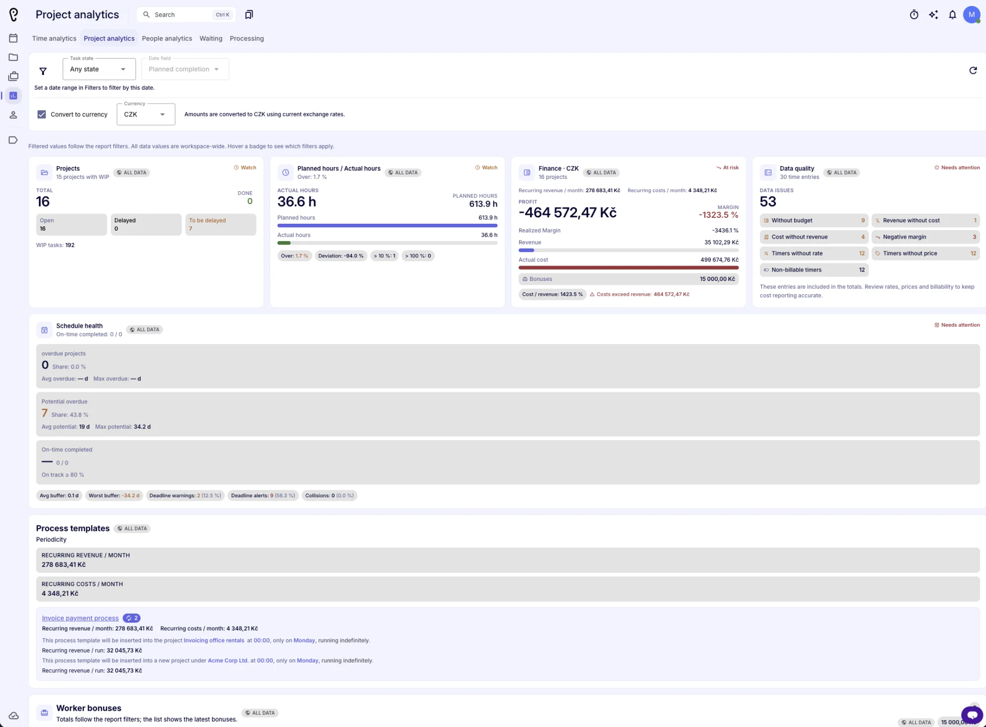
- Project analytics: A sortable portfolio table with revenue, planned and actual cost, profit, margin and cost/revenue ratio next to planned vs actual hours. Schedule health shows buffer, overdue days, potential delays, on-time completion, deadline warnings and collisions. Data-quality checks highlight missing budgets, missing rates or prices, non-billable entries and negative margins. Duration and age, the completion outlook by month, quarter or year, work in progress by status and label, project-manager reward inputs, and recurring revenue and costs from process templates all live in the same view.
- People analytics: See planned and ready workload, available capacity, utilization, effectivity and responsibility per person across the chosen horizon. Compare periods, follow the workload trend, rank people by workload, and spot anyone above 90 % planned workload.
- Waiting: Find out how long work waits between steps. The report lists predecessor and successor tasks with the exact wait time, so bottlenecks between teams are easy to spot.
- Processing: Compare reported time with estimates and see average calendar time and average waiting for each task status and label.
- Always in context: Totals follow your filters, while clearly marked badges tell you when a number covers the whole workspace. Every page has a refresh control, and hover hints explain each metric.
- Bonuses in reporting: Worker bonuses now appear in the reports and are included in actual cost, with a preview of the latest bonuses and a direct link to the full bonus list.
📅 A clearer schedule
- Find today instantly: The calendar opens at the current hour and a clear line marks the present moment.
- Better day headers: Weekday and date are shown separately, with today and weekends highlighted.
- New toolbar: A Today button, clearer navigation and a switch between people and projects make moving around the schedule quicker.
- Readable at a glance: Entries use calmer colours with clear hover, project and need-action states, and very short entries stay compact.
- Project milestones: Start, done and end milestones are now precise markers, coloured by urgency so delayed and overdue projects stand out.
- More accessible: Controls and date pickers now have clear labels for screen readers and keyboard users.
🤝 Customer workspace
- Customer detail page: Open any customer to see a complete overview in one place: the projects portfolio, contacts and connections, monthly finance and a finance balance summary.
- Projects portfolio: Project rows expand in place to show revenue, cost, net cash flow and realized margin, with a direct link to open the project.
- Finance at a glance: Budget, total funds, remaining budget, total costs, realized and unrealized income and outcome, planned and tracked time cost, and the final margin are grouped in a clean balance card.
- Contacts and connections: See who is connected to the customer and jump between related contacts without leaving the page.
- Sticky header: The customer header stays in view while you scroll through long project lists.
- Cleaner structure: Categories and contact roles moved under Labels, where they are grouped by Project, CRM and People.
🎁 Worker bonuses
- New bonuses page: The Users area now has a dedicated Bonuses tab next to the people list and organizational structure.
- Simple entry: Add a bonus with the worker, amount, name, period and an optional note.
- Clear overview: Bonuses appear in a sortable list with worker avatars, can be filtered by period, and can be removed or restored.
- Connected to reporting: Bonuses flow into project and customer finances, so actual cost stays accurate.
🧾 Project insights in lists
- Show insights: A new toggle in the project list adds extra columns for decision waiting time, completed tasks, all-versus-completed tasks, captured versus estimated time, scheduled collisions, captured time and overrun time.
- Finance for managers: The task list can show project finance columns, and customers can be opened directly from projects and tasks.
- Collapsible finance cards: Finance cards in tasks can be collapsed, and realized income, outcome, margin and cash flow are shown alongside planned values.
- Focused reports: The CSV download buttons were retired so reports stay focused on on-screen analysis.
🧠 APU and chat
- Fullscreen chat: Open chat in its own fullscreen window and keep working while the conversation stays in sync with the selected channel.
- APU asks when it is unsure: When your request is ambiguous, APU can now ask a clear question with a few lettered options or a custom answer instead of guessing.
- Smoother menus: Recipient selection and filters use lighter menus that keep long lists fast and wrap cleanly on small screens.
- More reliable connections: AI connections are more robust and recover gracefully from network interruptions.
🧩 Process Studio
- New showcase gallery: Start from ready-made examples, including identity rebranding, a solar installation, an event conference, invoicing, hiring, teambuilding, a newsletter, feature requests, client onboarding and incident response.
- Interval summaries: Recurring templates show a readable summary of their schedule, with highlighted times, days and months.
- Customer targets: Recurring templates can now target customers as well as projects.
- Recurring revenue in reporting: Reporting shows recurring revenue and costs per month and per run.
- Simplified editor: The old magic list dialog was removed, and template creation now explains clearly when you need to contact your administrator.
- Consistent navigation: Process Studio and Categories use the same navigation button styles as the rest of the app.
✨ Everyday polish
- Sticky task details: The task detail header and its tabs stay visible while you scroll, so context and actions are always within reach.
- Phone improvements: The timer shows its controls on phones when idle, and the theme menu and language selector fit small screens better.
- Event tasks: Event tasks now require a start and end date, and the event type is preserved when saving.
- Printing: A new print layout hides the app chrome, uses the light theme and avoids awkward page breaks.
- Wider layouts: The schedule summary and bonus tabs use the full content width.
- Documentation: Demo and interactive guide content is temporarily hidden while it is being refreshed.
- More languages: German, Czech, Spanish, Hindi and many other translations were updated and expanded.
We hope these improvements make your daily work clearer and faster. Thank you for using APUtime!